2006
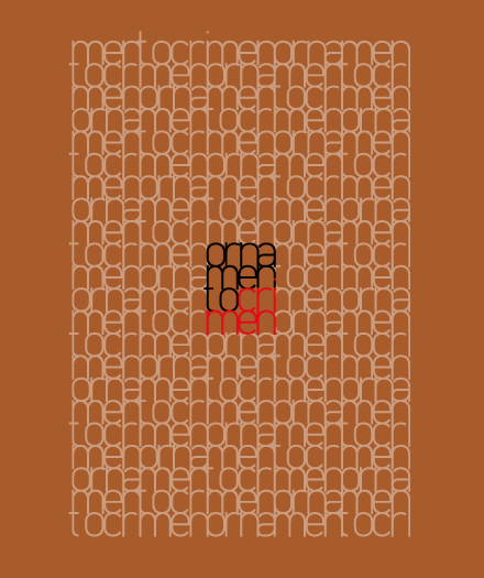
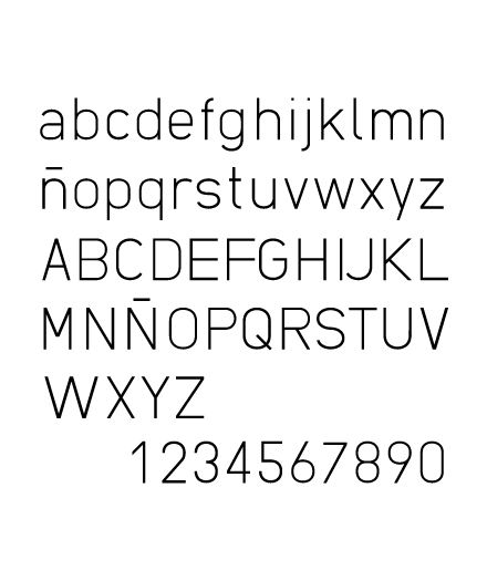
Racional Light es una tipografía de base geométrica no adulterada y, al tiempo, legible y agradable para texto.
Desde la Bauhaus, muchos han sido los intentos de reducir las letras del alfabeto a sus formas geométricas más básicas. Sin embargo, a la hora de convertir estos ejercicios formales en tipografías de uso real, se recurre a sutiles «trucos» visuales para humanizar y dulcificar su aspecto. Los medios de reproducción cambian, y también nuestra percepción estética, y eso me ha hecho preguntarme si, ya en pleno siglo XXI, estamos preparados para aceptar la geometría pura en nuestro espacio tipográfico.
Racional Light is a typeface of unadulterated geometrical base, yet legible and pleasant to read.
Since the Bauhaus, many attempts have been made to fit our letterforms into their most basic geometric shapes. However, when it comes to converting this formal exercises to real life typefaces, subtle visual «tricks» are used to humanize and soften their appearance. The means of reproduction change, and so do our esthetic criteria, and that has made me question myself if, in the XXI century, are we ready to accept pure geometry in our typographic space.